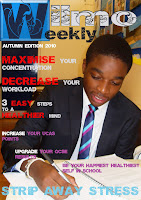
For the past week, we have been working on presentations to share with the class on certain aspects of a music magazine. The aim of this is so that we can all grasp a greater understanding when we are crafting our magazines.
Tuesday, 20 December 2016
Friday, 16 December 2016
Music Magazine Task : Chosen Shot For Contents Page
Wednesday, 14 December 2016
Music Magazine Task : Shots
 |
| I like this shot the most, and I believe that with some text editing I can make a good cover using this. It gets a good serious vibe that is often seen in hip-hop artists. |
 |
| This shot also went very well, this shot may be good for my front cover. I believe it gives a good serious vibe that I can use for my magazine. |
 |
| This shots purpose is to undergo a lot of editing to create an appropriate shot. I Intend to create a much darker image through photoshop |
 |
| This is also one of my favourite shots However I am yet to find where I can use it in my magazine. Much like the previous two shots, this one captures the vibe I am aiming for. |
Friday, 9 December 2016
Music Magazine Task : Location
For my magazine's shot, I will require a location to take the picture. My actor and I are going to ask for permission to use our schools drama studio during a time when it is not being used. To do this, we will ask the head of drama what times the studio is being used and if she would be willing to allow us to use it for a short period. The reason we have chose to use the studio is because it has good lighting and overall is a very clean area to take simple shots.
Wednesday, 7 December 2016
Music Magazine Task : Costume & Narrative
Music Magazine Task : My Actor
 My actor and I have agreed on the shot, props and location of our picture. We're going to try to arrange an appropriate date for both of us so that we do not cut into our learning time. We have already arranged to wear specific clothes that is relevant to my magazine's theme and genre. I will update my blog and to detail what props we will involve.
Friday, 25 November 2016
Music Magazine Task : Planning & Time Management
My Teacher and I discussed the planning and time management that is necessary to achieve an appropriate shot. I will blog all of the tiny steps I take into arranging the magazine, from taking the initial image all the way to editing the front page.

It will be beneficial for my also as It will help my handle each task ahead of me one by one, which will reduce confusion. I am going to discuss with my actor when we are both available, where we will take the shot and what props will be used. Once we have arranged each one of the steps, I will blog it to make sure I am keeping track of my progress.

Music Magazine Task : Centered Genre
Monday, 21 November 2016
Vibe Magazine Analysis : Colour Palette
 Vibe Magazine uses very basic colours that stand out and catch the readers eye. The most common colours are white, black and a key bright colour. These colours are both urban and very simple. The reason why it decides to use two simple black and white colours and then a bright vibrant colour is so that it catches the reader's eye on shelves.
Vibe Magazine Analysis : Title
 The title 'Vibe' is a very simple, catchy title that is rememberable. It matches the magazines theme, as a very urban and relaxing 'vibe'. In addition this this, we know that the original colour palette of the magazines use 3 colours. 2 of which are black and white so that the brighter colour will become more eye catching. This matches the magazine's title as it's house style is very simple and clear.
Vibe Magazine Analysis : House Style
 Vibe have a common theme of featuring very successful artists on their front pages. This makes it feel more professional to the reader. It is features really bold text that stands out on the page, making keywords in a bigger size. This is very catching to the human eye and are likely the draw attention when displayed on shelves. The keywords that are displayed in a bigger size are words that may grab the readers attention. E.g. Celebrities names.
Friday, 18 November 2016
Vibe Magazine Analysis : Price
 The price that Vibe Magazines are available for are around £3.99 - £4.99. However, they also offer a subscription for £6.65 for 6 issues. I can use this information to assume it's audience in terms of age varies as the £3.99 issues are one that can be bought by older teenagers to young adults from pocket changes, whereas the £6.65 seems something that a older person may purchase.
Wednesday, 16 November 2016
Vibe Music Analysis : Genre
 The genre Vibe Magazine is mostly associated with is urban hip-hop and rap music. I know this because it features many rap artists on their front pages in selected issues. The genre featured also reflects the target audience as rap is mostly seen to be associated with an young, male audience. However, it also features several R&B artists which may appeal to a female audience as the genre is mostly associated with females.
Vibe Magazine Analysis : Gender
 Vibe Magazine's targeted gender is mostly males. This is because the rap genre is mostly associated with males rather than females. However, the magazine does also feature several R&B and dance music singers like Rihanna. When celebrities like Beyonce and Nicki Minaj it is likely going to appeal to the female audience.
Vibe Magazine Analysis : Age Range
Vibe Magazine Analysis : Audience.
Personal Improvements
Pictures
- I should try to add some variety by giving different types of pictures (close-ups etc)
- I should take the text space in consideration before taking a shot.
- I should take mise-en-scene, background and narrative to make.
Editing
- I should make sure the page numbers make sense on my contents page.
- I should plan ahead and take more time when in photoshop
Friday, 11 November 2016
More Style Models
Here are some more style models I have took several ideas from to help improve my pre-lim task to maximise it's appeal.
Monday, 7 November 2016
Frontpage Photoshop Editing
For my pre-lim tasks front page, I have:
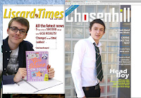

- manipulated the layers to make it look more appealing
- removed several backgrounds
- added other external pictures such as the logo
- added several effects to the text such as shadows and inner glows
With a few days of photoshop practise i believe i have been able to make an appropriate front page for my pre-lim task. I have also included the style model my front page is inspired by.
Friday, 21 October 2016
More Photoshop Practise Update: Removing Backgrounds & Manipulating Layers
Last lesson, I revised over Photoshop and it's layers to make my editing more effective. In this minor picture, have have gave it a background and made my text go behind Jessica's head.
Pre-lim Task: Photoshop
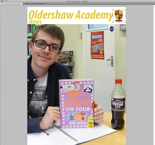
Today I have practised using Photoshop to create a front page for my magazine. This is a nice trial run on editing my front page for my pre-lim task. I have cut part of the image and made it into a header, also I have added a Oldershaw Logo to help get the school image across
Sunday, 16 October 2016
Pre-lim Task: Chosen Shot
Here is my chosen shot from the several pictures I took during our trip to the school's library last week. I believe this one is most fitting as It captures all of the props I intended to and also has a clear narrative unlike some of the other shots I took. In addition to this, my actor gave a suitable smile that suits the happy student narrative I am going for.
Pre-lim Task: Overall Result
Here are my (5) shots I took in our free-time for my pre-lim task. I am overall pleased with the result despite not being able to obtain at least 6 suitable pictures. The picture's narrative was captured to my liking and I look forward to improving in the near future.
Pre-lim Task: Mise-en-scène
As far as props go for my pre-lim task. I have chose standard educational material such as pens, books and text books. I have told my actor (Matthew) that I will bring in all props for our shot. We now only need to find time to take several pictures and decide which ones are the best.
Pre-lim Task: Actor
The actor I have chose for my pre-lim task is a fellow pupil Matthew who is also part of my Media Studies Class. We have discussed a possible shot in which he will be equipped with various educational material such as books, pens, and text books. I will provide the consent form for Matthew to sign to declare he is comfortable with being the actor for my pre-lim task.
Pre-lim task: Location
The location I have chose for my pre-lim task is our school's library. I have chosen the library because I believe it's a good educational environment that will reflect on my pictures.
Wednesday, 12 October 2016
Pre-lim task: Consent Form
This is the form I will have my actors sign to confirm that they're comfortable with pictures I am taking for my project, so there will not be any legal issues.
Tuesday, 11 October 2016
Picture Plan
Today I have discussed my plan for a photo with a fellow student.
Matthew (my actor) will be sat at a desk in our library with a plastic bottle, book, and pen in hand and with a joyful smile. The story behind my image is to give a happy, healthy and educated vibe from the student. I have took several practise shots during my lesson that I will update when I get access to our schools group folder where they have been saved.
Wednesday, 5 October 2016
Research - Style Models
Q Magazine
The research I have made regarding the Q magazine’s
audience, age range, genre and price is as follows;
· -The target audience is aimed at a older
generation who are still buying CD’S
· -The age range is around 15-44. Statistics show
that this is around 83% of the customers.
· -The genre is often rock as it features bands
such as Metallica and Kings of Leon.
Subscribe to:
Comments (Atom)
-
Vibe Magazine uses very basic colours that stand out and catch the readers eye. The most common colours are white, black and a key bright co...
-
Q Magazine The research I have made regarding the Q magazine’s audience, age range, genre and price is as follows; ...

